Anyone who has done any work with print is familiar with the CMYK (Cyan/Magenta/Yellow/BlacK) colour scheme. (Most web images are done with the RGB (Red/Green/Blue) scheme.) In either case the idea is that, by using a few colours and mixing them properly, one could produce the effect of many colours, thus making it possible to have a realistic image. Traditionally, to produce a colour page, one ran the page through the press four times, one for each colour. Hopefully the four colour images would line up with each other; when that didn’t happen, it was an obviously bad press run. Colour printers work the same way; they apply each of the CMYK colours from separate ink supplies, the main difference is that they do all four colours simultaneously.
But what if…there were images where the colours were really separate from each other, or nearly so, where you could see each colour of the CMYK scheme. That’s basically what the Coast and Geodetic Survey did with their nautical charts in the 1960’s. By cleverly using the basic colours of the CMYK charts, they could produce a chart that was easy to print and read.
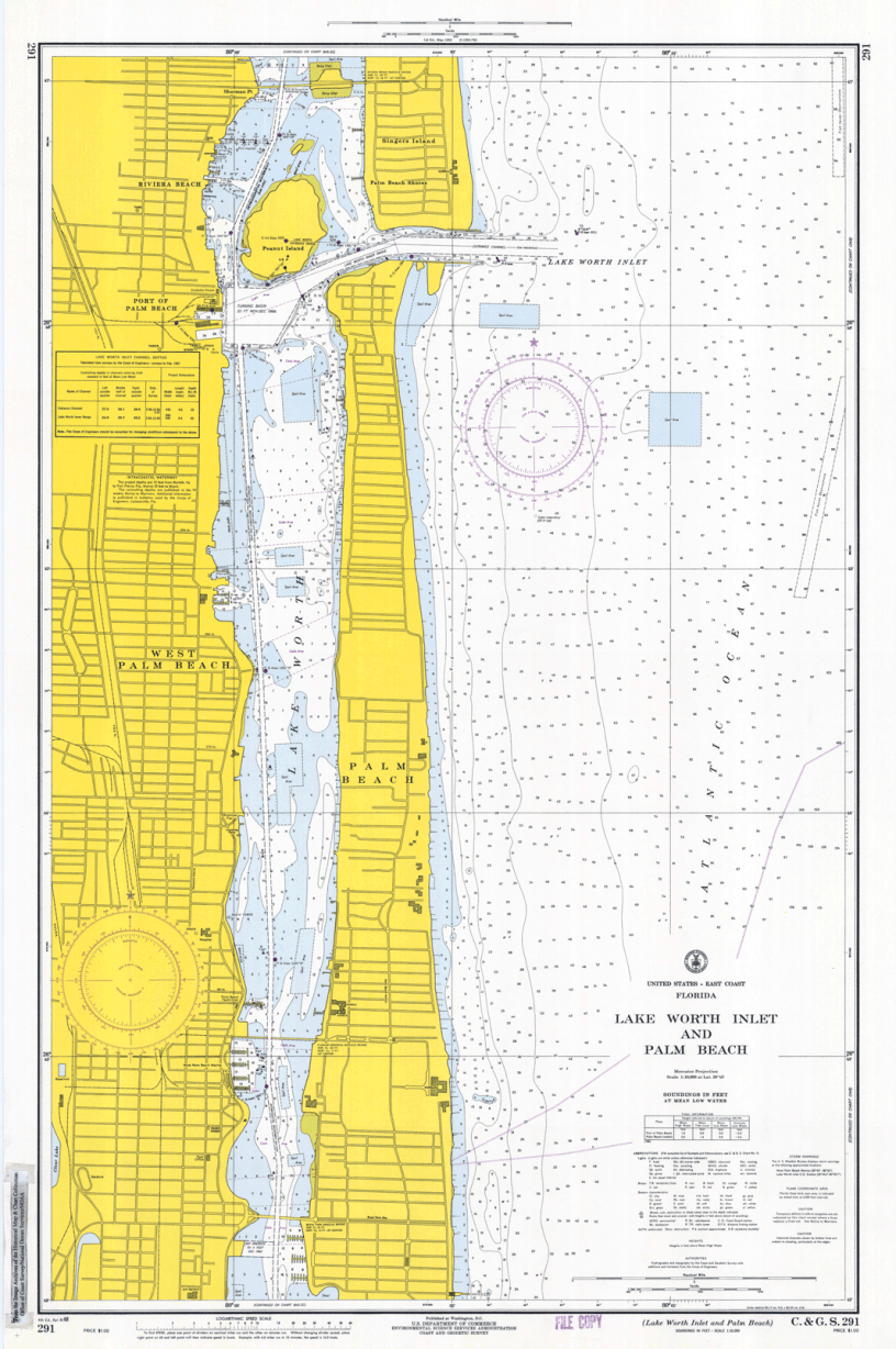
Let’s start with the example above: Chart 291, April 1968, showing Lake Worth Inlet and Palm Beach. It’s the centre of a great deal of the action depicted in the yachting and “Palm Beach Experience” part of this blog. Let’s zoom in on a few places on the chart.

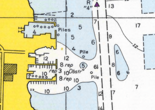
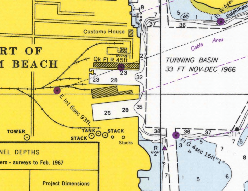
Yellow obviously represents the land. The cyan areas are shallow water and the white areas are deep water. What constitutes “shallow” and “deep” depends upon the chart. For inland water charts like this one, the break point is around one fathom (6′.) For deeper water charts, it can be at the continental shelf. Black is used for borders, shorelines, numbers and letters, etc.
Magenta is, in many ways, the most interesting colour. The magenta circles with the black dots in the centre are lit aids to navigation. Those that are not lit are generally red coloured buoys and markers in real life, while those in black are coloured green in real life. Magenta was also used for the compass roses.
For another example, we’ll head to the Florida Keys, where we visit C&GS Chart 849, showing upper Key Largo.
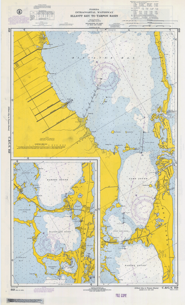
Our use of this chart was to go down to Ocean Reef, which is towards the north end of Key Largo just below Anglefish Creek. We first visited the place in 1965, a little over a year before the chart was issued. It was very much in the early stages of development and a little rough around the edges. It wasn’t exactly “Bogie and Bacall,” but it was fun.
One other thing that was worth noting was where the chart mixes cyan and yellow to produce green swampy areas, which you can see in the upper left hand corner of the chart.
For further voyages, we look at this, modified from Chart 1002, October 1966.
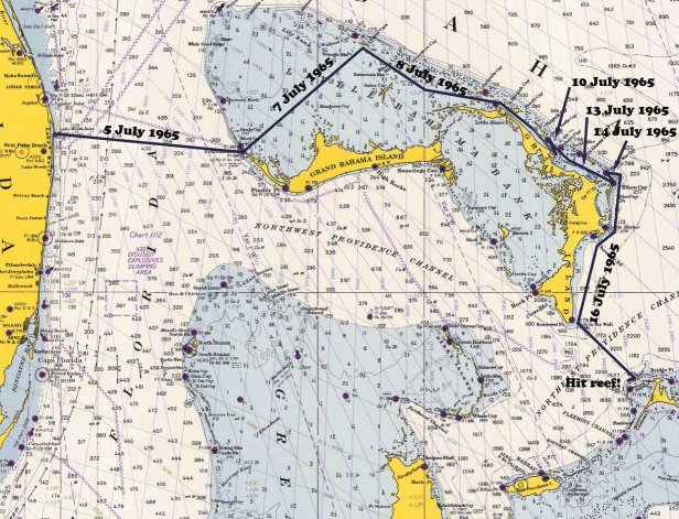
It shows the course of our 1965 cruise to the Bahamas until we almost went to the bottom near Spanish Wells. The blue areas are on the Continental Shelf and the white ones are off. The depths are in fathoms (6′.)
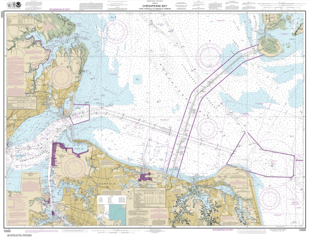
The chart-issuing authorities of the United States eventually decided to “up their game” with colour separations, which is obvious in this chart from 2015 showing the lower Chesapeake Bay area in Virginia.
The charts back in the day, however, are interesting examples of both cartography and colour printing techniques.
